Membership App Personal Project
BlocRock
This is a personal project I am conducting to refine my UI design skills.
A simple membership app that allows users quick access to their membership card, updates from their gym, and other services to improve their experience bouldering.
Concept
About this case study
This is a design project I conducted to refine my UI design skills. I take claymorphic design and apply it to a design challenge - creating a membership application for a bouldering gym.
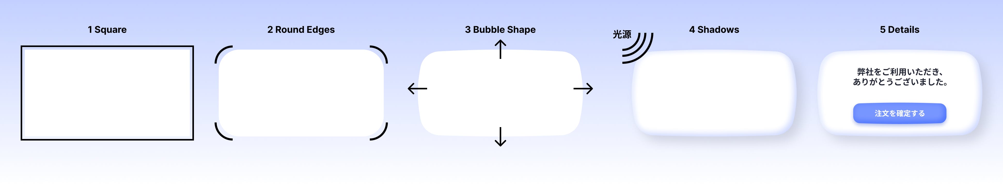
About claymorphic design
Claymorphic design is a trend that occurred in 2022 - it involves creating user interfaces that appear to be like clay. I picked this design trend as it makes use of shadows - an area in graphic/UI design that I needed to refine.
Study
I studied claymorphism through researching tutorials, and other implementations by others - both designers and developers.
Below is an example of my experimentation while learning.
Resources studied
Claymorphism in CSS:
- 2022年、Webデザインの新しいトレンド「クレイモーフィズム」のスタイルをさまざまな要素に適用できるCSS
- Example Dashboard
- Claymorphism Effect with HTML & CSS
- Claymorphism: Will It Stick Around?
UI Design
- Claymorphism in User Interfaces
- Claymorphism tutorial – How to mimic clay in UI design
- Dribble claymorphism search
- Why Claymorphism Is Cool in 60 Seconds
- Claymorphism in Figma Tutorial
- Claymorphism in User Interfaces
Illustrations, Icons
Concept Project
To learn how to implement claymorphism into a project, I created my case study - BlockRock.
About Blockrock
People who frequently go to bouldering gyms always carry their wallets, mobile phone, and their membership card.
However, as people go to many gyms, it becomes painful to carry a membership for each gym. A digital membership card is a strong plus for bouldering gyms.
Some bouldering gyms have a membership card app, but many of them are OTS (off-the-shelf off-the-shelf software products), and the UI and UX are not optimized.
BlocRock chose bespoke software to deliver an easy-to-use membership app to its customers.
This is that application.
Why this case study
I wrote/chose this case study as it is a true issue myself as a user of bouldering gyms felt, and also a similar problem others I know discussed with me.
Furthermore, bouldering is an application/industry that matches the claymorphic style.
At bouldering gyms, there are holds (places to grab) instead of stones. Since these holds in bouldering are three-dimensional, a 3D/plastic-like UI such as claymorphism fits in with this context.
Starting Steps
To implement my new knowledge of claymorphism, and to start ideation I created ideas for the home page.
This was a good way to kickstart the project and get inspired, however, I regret not taking more time to think about the overall layout. If I were to redo this I would add in a specific step for ideating the content better.
To the right is an example of what the home page looked like at this stage.

Competitor Analysis
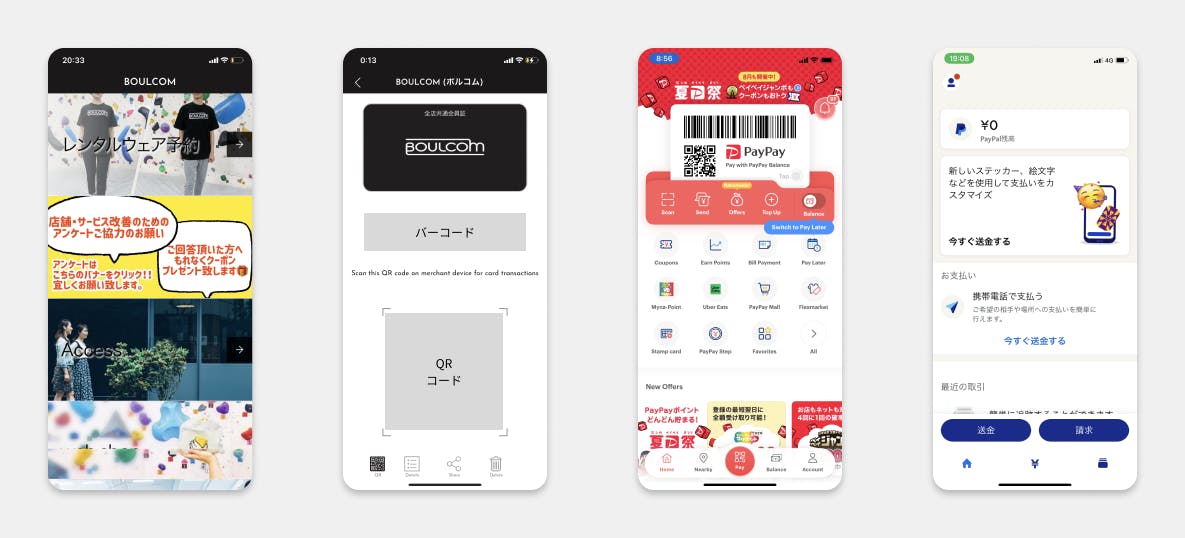
To determine the design direction of the application, I reviewed the applications of competitors.
Since there are few applications for bouldering gyms, I also reviewed cashless payment applications that eliminate physical cards.
- ❌ Other Bouldering Gym Apps are slow, with the membership hidden from the main page - leading to users left waiting in front of reception when they try to use it.
- ✅ Popular payment applications, that are replacing credit cards have their barcode/payment information available on the main screen.
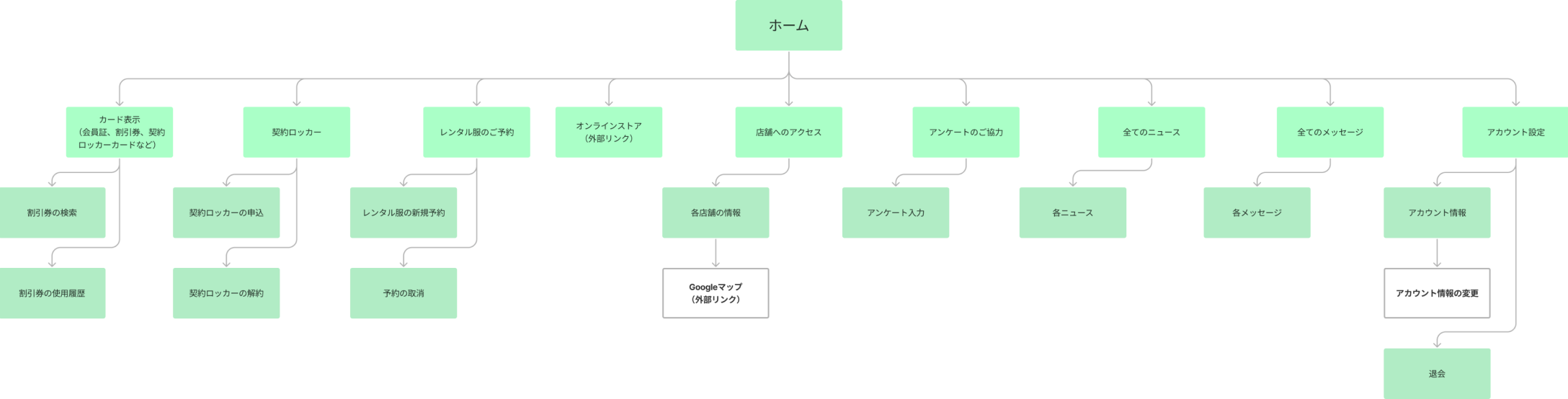
Sitemap
Based on the concept page, I created a sitemap to understand where the home page lives and what is needed.
Other Pages
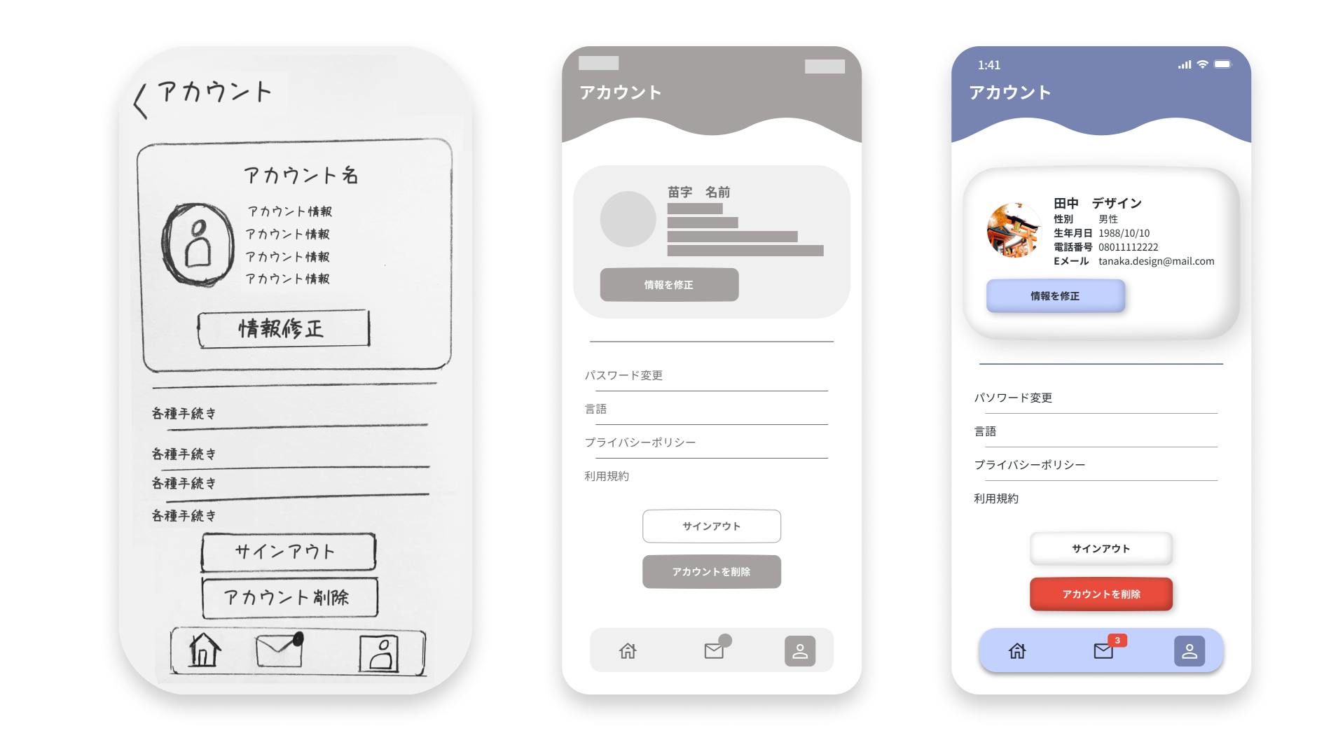
From the sitemap, I picked other pages to create. For complex pages such as the account page, I went through a paper idea -> wireframe -> high fidelity process.
Logo Creation
For the Logo, I also went through several iterations during ideation, before settling on the current design. My specialty is not graphic/logo design, but this is an area I want to gain more experience.
Testing and Refinement
As this is a project I am doing to practice my UI design skills, sadly I have not yet conducted testing or validation of the designs.
This is a step I would like to do in the future to improve these designs from a UX perspective, and to see how users react to the claymorphic design.
Maintenance/Figma File
For designs to be maintainable and easily adaptable, I managed UI elements as a UI Kit in Figma.
Ideally, these Figma components will act as the base for Development Libraries.
You can see a Figma file with such items, and other designs for this project via the following community file. Please be aware that this may be out of date, and the Figma work is not a representation of my best UI/Figma work.

Designs
Links


Points
Below are some points about the design that I worked on.
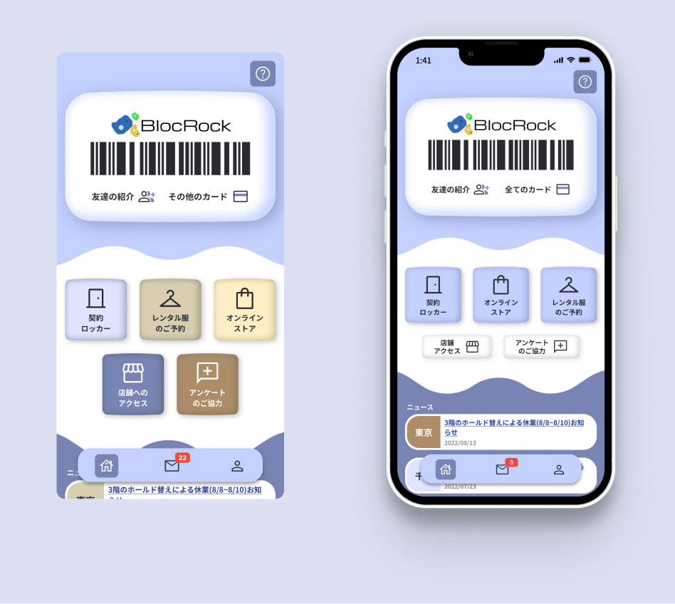
For the home page, I ensured that the member barcode is first on the page, so users who open the application to enter a gym do not need to go through any steps to show their barcode.
This is a design attribute taken from role model applications, such as paypay.

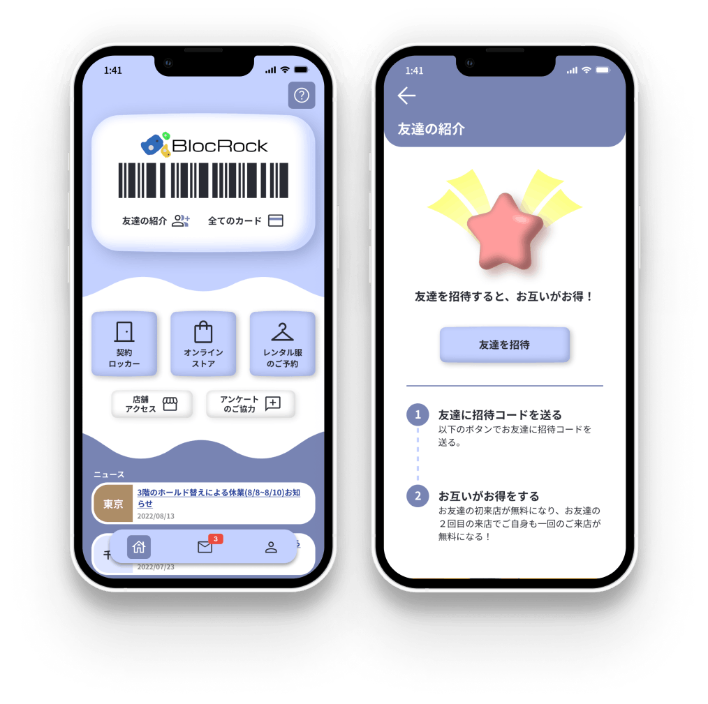
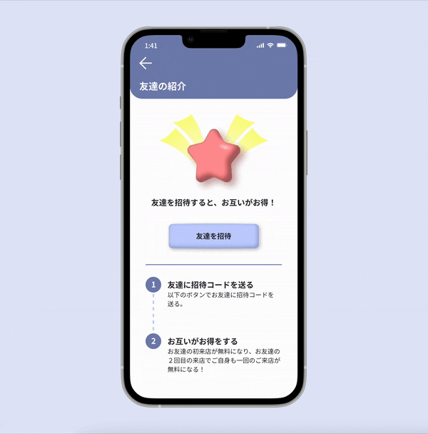
For the friend invite feature, I tried to include fun with a floating and moving illustration. Animations such as this are a design skill I want to refine. I also created this in the claymorphic style to match the UI and study how to create 3D objects in this style.
On the home screen, I simplified the color pallet on buttons. This was for visual simplicity, consistency, and accessibility of buttons.
To maintain hierarchy, I created a larger tile button and a smaller secondary button.
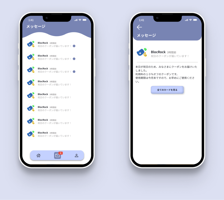
There is distinct difference between the "Main Pages" design and "Detailed Pages".
Main pages have a navigation bar and a curly effect on the top of the page.
Detailed pages have no navigation, and a modal like top header with the back button.
Words of Reflection
This is a personal project I am conducting to practice my UI design skills.
While not perfect, I hope this case study can express some of the following:
- How I learn new design trends
- Processes I use when working to create mockups and designs to propose to clients
- My thoughts/way of thinking