Gallery Feature Addition
Portfolder
Portfolder is a new social media service where users can create different “Folders“ on their account to showcase their passions and work.
During the creation of their new NFT Artwork Gallery, I was asked to review their ideas and give advice on the design.
Request and Brief
Draft
Hearing
Refine
Delivery
Request and Brief
I received a request for advice and help from the client via email. In this email, they included information on their UXUI dilemma and the UI designs they (Engineers) have created.
They asked for a review of these designs, and if I had any advice.
Brief from Client:
- They are creating a feature to showcase NFTs that users hold.
- They want it to be a “Rich“ and “Appealing feature“ for customers.
Draft
In order to help them, I started to review the screens they provided, taking notes and creating my draft proposal. I also wrote down other comments/possible improvement points of other pages outside of scope.
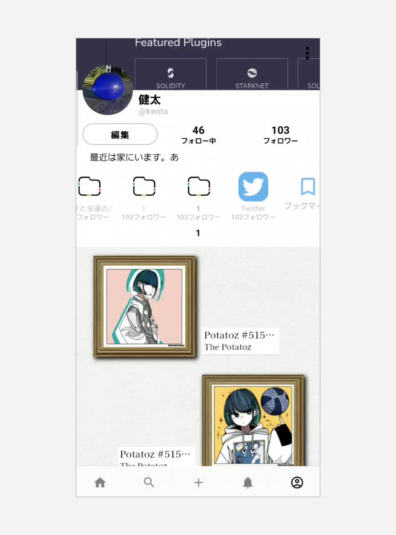
Image received from client
Comments
About the NFT Gallery:
- Each Artwork is small and does not look appealing
- It is not modern, and therefore may not feel “Rich“ or “Appealing“ as the client wants.
Having Animations may be a big part of it becoming a rich feature. - Various whitespaces could be used in some way
Perhaps having several ways to show the NFTs, and letting the user pick how to show it would be fun
Other:
- The fixed header is large but always seen. Perhaps it can be hidden on scroll down and shown on scroll up.
- There are some usability/error-handling concerns on other application pages.
- etc.
Hearing
Before giving any advice, I conducted a hearing with the client to understand their situation and requirements.
During this meeting, I provided feedback on their drafts, gave advice on other screens, and discussed my drafts.
My drafts presented
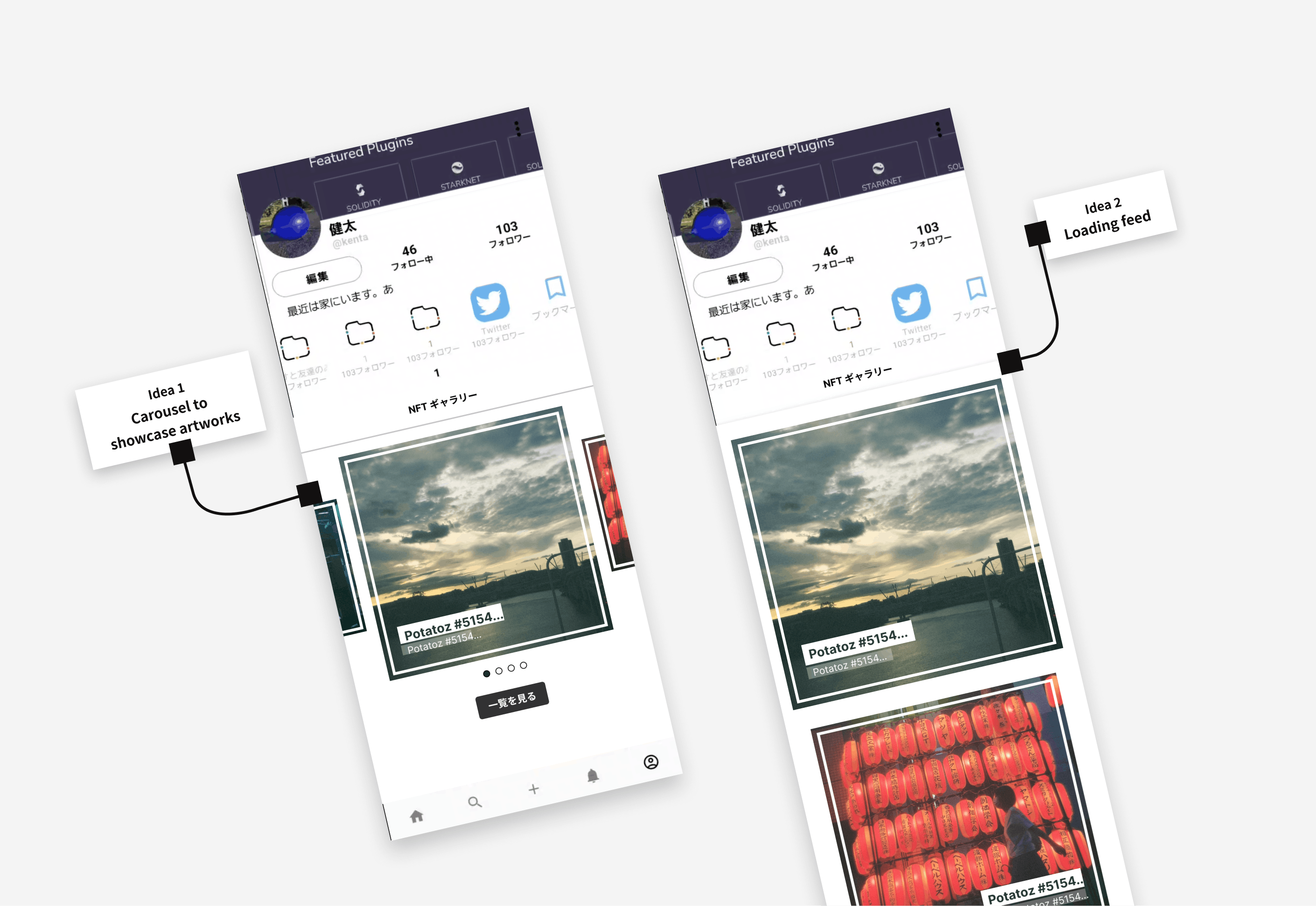
Feedback received on drafts and ideas discussed
- Both ideas are good.
- There will need to be a desktop version - we discussed if this will need to or can adapt the current UI.
- Perhaps there can be an “overall“ view where all NFTs owned can be seen.
Refine
Based on the meeting with the client, I worked on refining my designs and creating the needed patterns.
Changes and refinements:
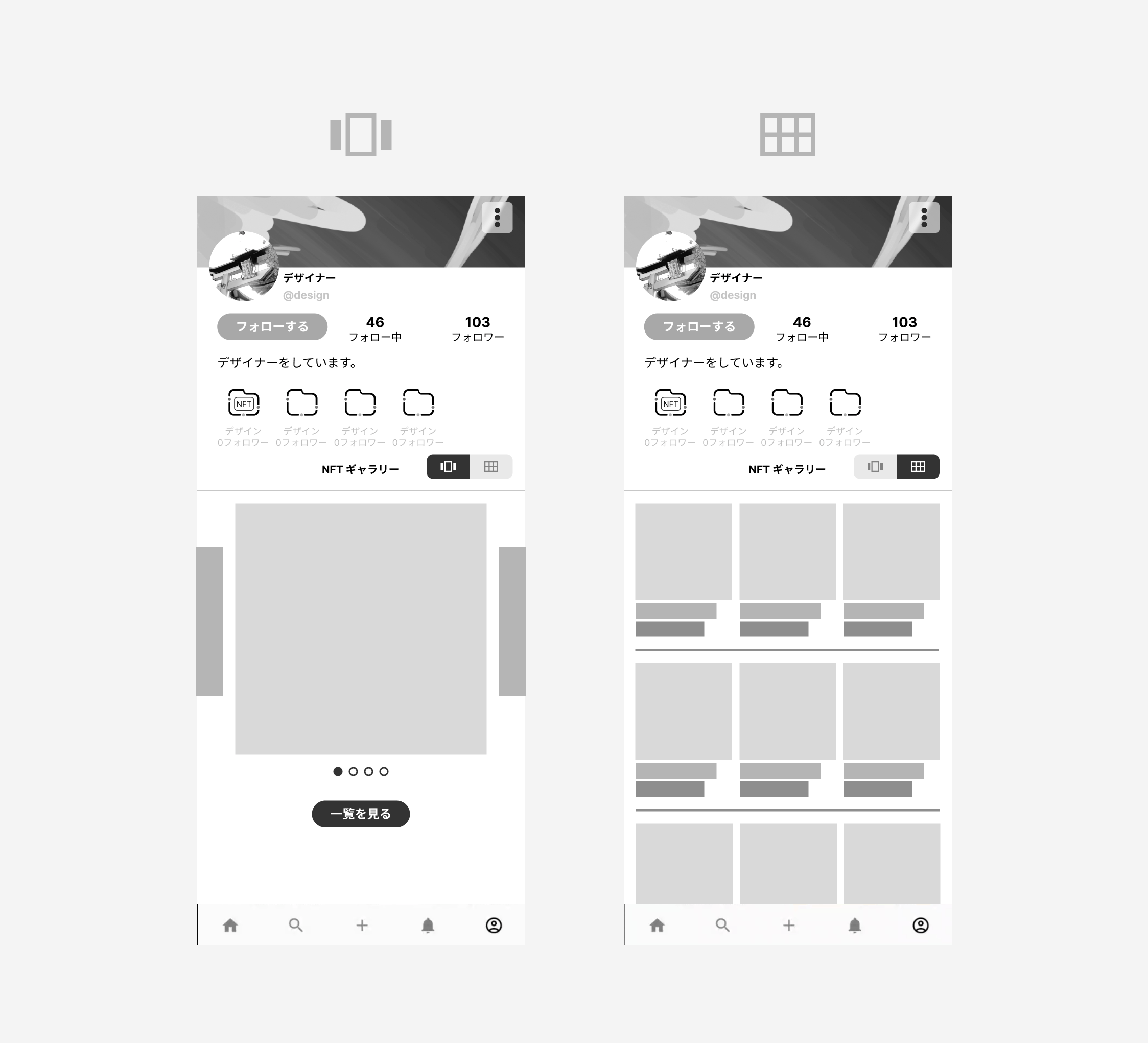
- Designed “all view“ with small images.
- Added in new proposals for the client to think about (Displaying info with NTFs).
- Added a switcher between the presentation view and the all view.
- Added in animation to show the client how they can help create a rich feeling on desktop devices.
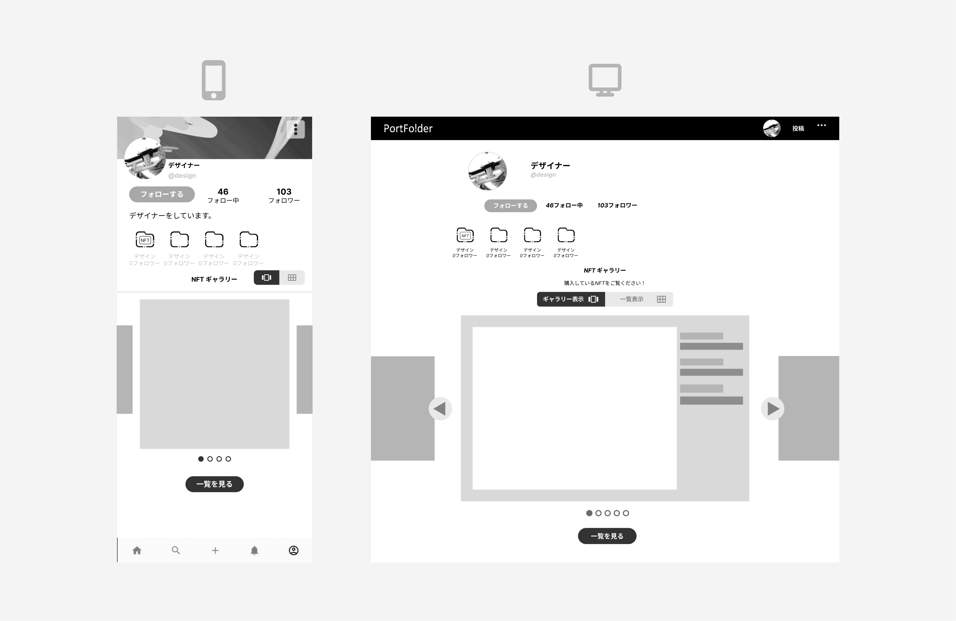
- Created desktop version.
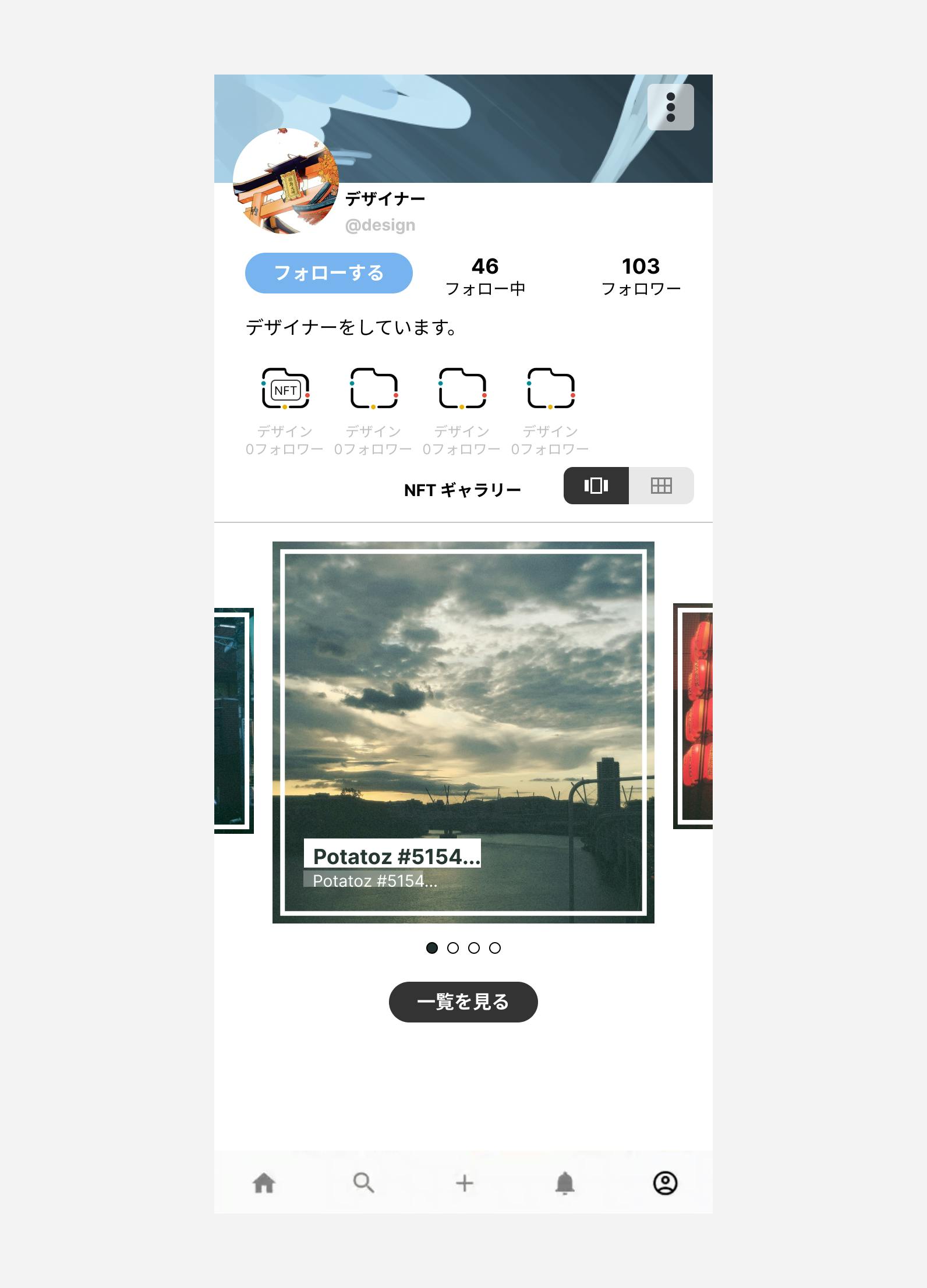
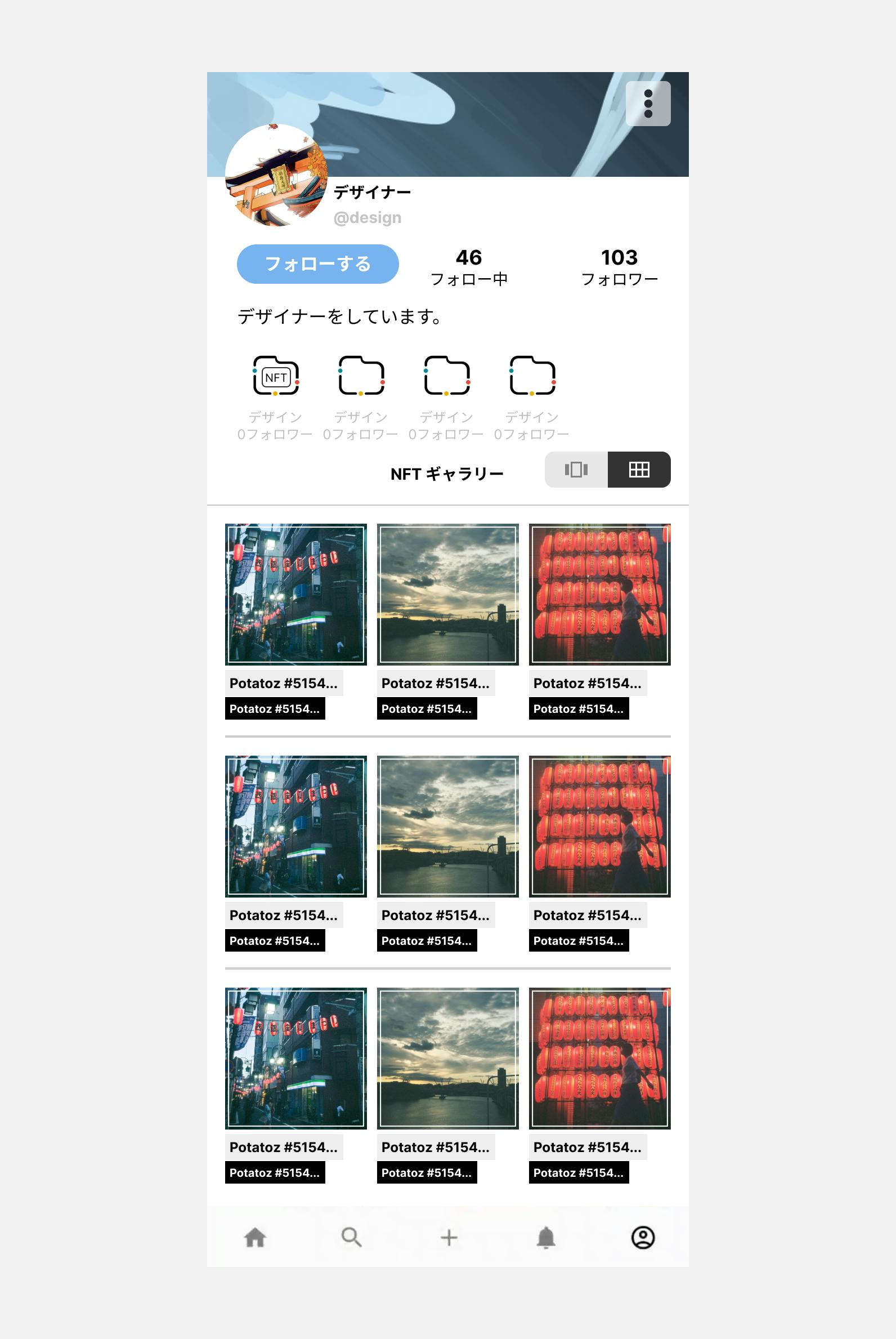
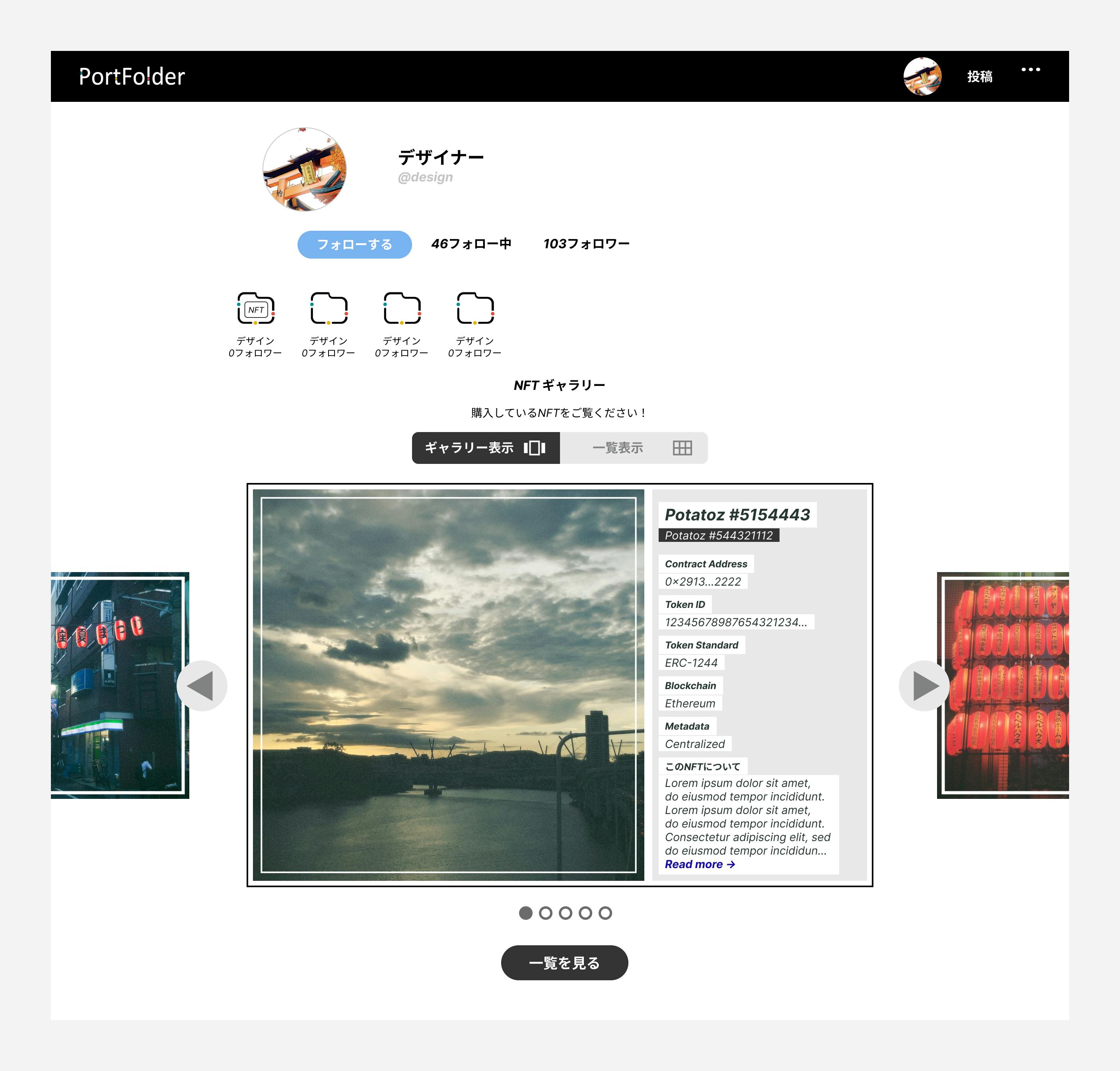
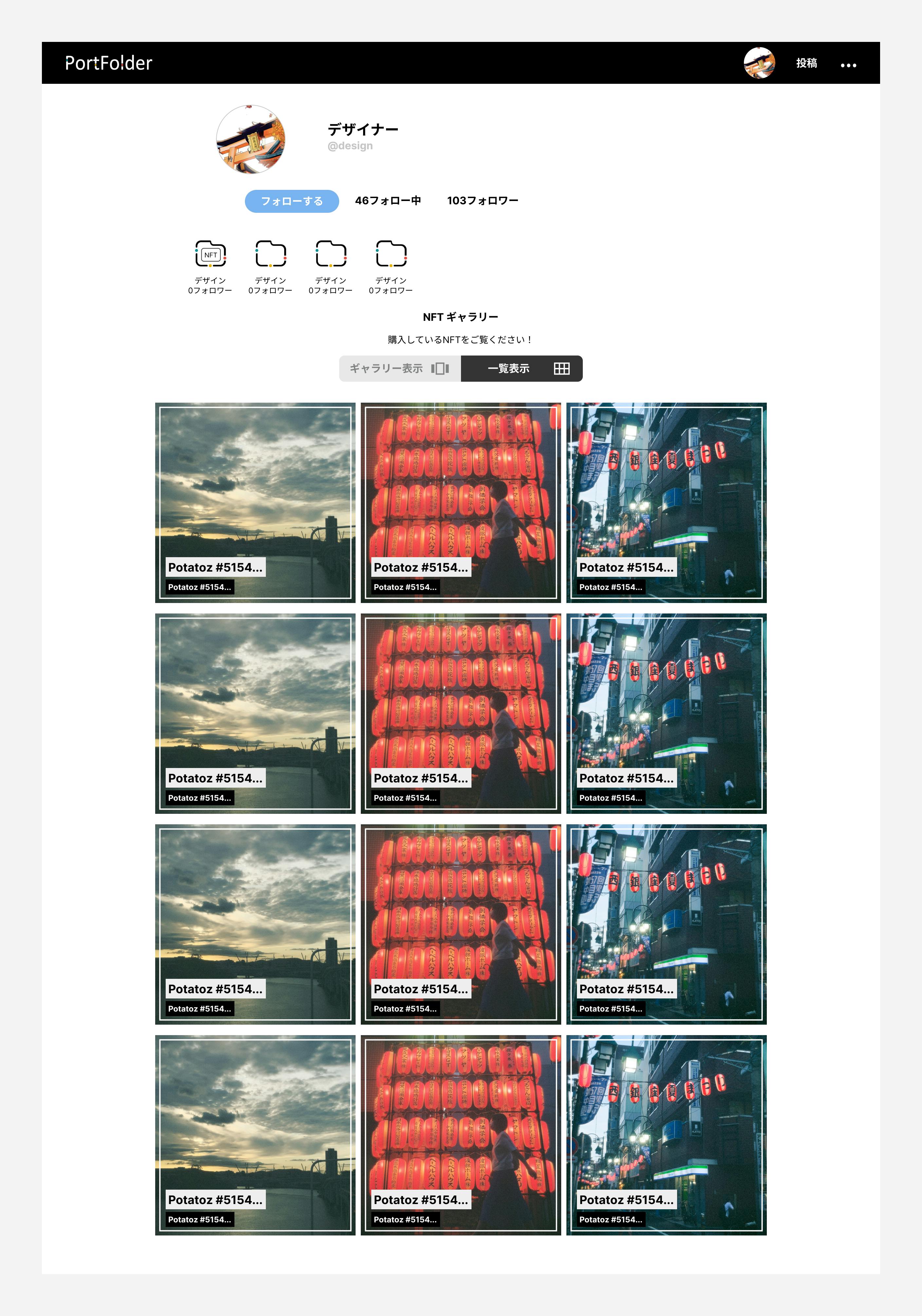
“Gallery view” and “all view"
Mobile size and desktop size
Deliver
Below you can find the final designs provided for this request.
These were provided to the client for them to implement, and I have opened the door with the client for future design improvements based on user feedback.
Prototype Links


Screen Images
Mobile gallery view
Mobile all view
Desktop gallery view
Desktop all view
Animations
Words of Reflection
This case study shows how I helped with a small UXUI problem quickly.
Ideally, designers need to be involved in products from initial discovery to development, implementing user tests, and iterating our designers.
However, in a work environment, designers are often asked for “one-off“ spot support, by numerous teams. I hope this case study shows how I can provide value in said work: being communicative, giving suggestions, and providing some form of “mockup” to convey these suggestions.
In the future for said work, I will implement simple user testing in this process to validate my suggestions before proposing them.