Creation of a multi-language portfolio
Portfolio Site
This site is my project conducted to enhance my grasp of development technologies and address a unique challenge faced by designers in Japan like myself.
This case study will go through the various steps taken to create this site and information on areas that I particularly put effort into.
Please note that I am trying to organize the content in this case study in chronological order, but my approach for this was very iterative, so there may be some discrepancies between sections.
Concept
The Problem
As a designer in Japan, I need a portfolio site in both Japanese and English to cater to a diverse audience.
Existing platforms like Square Space offer localization but at a high cost. This project aims to provide an affordable solution for creating a multi-language portfolio.
Requirements for project
- Is in English and Japanese
- Is easy to manage
- Is secure
Status
- Version one is released on GitHub for anyone to use
- Site is Multi-language
- Site is connected to Headless CMS for management
- Basic auth is implemented for security
- There are a series of “slices” created and ready for use when creating pages
Technology Used
Creation of base
I started by creating a basic foundation for the website.
I did this for a few reasons:
- It's part of my learning process for HTML/CSS, giving me a quick sense of accomplishment to keep me motivated.
- Since I'm not a professional developer, I prefer starting with an imperfect base. It's easier for me to build upon and adjust, rather than trying to build something perfect from the beginning.
Base from Figma
To build the foundation, I utilized the Figma plugin "Figma to HTML" to generate a basic React project. The process involved these steps:
- I designed a simple webpage layout in Figma, featuring a case study site with navigation and links to individual case studies.
- Using the Figma to HTML plugin, I ran a preview and saved the automatically generated React project.
- Thanks to the auto layout feature in Figma, the React project closely mirrored the original design, maintaining the structure and layout to a large extent.

Fix Base
Despite being a good recreation of the design, the generated React site had issues such as:
- Misaligned card heights
- Left-aligned content
- Missing hover effects
- Lack of responsiveness
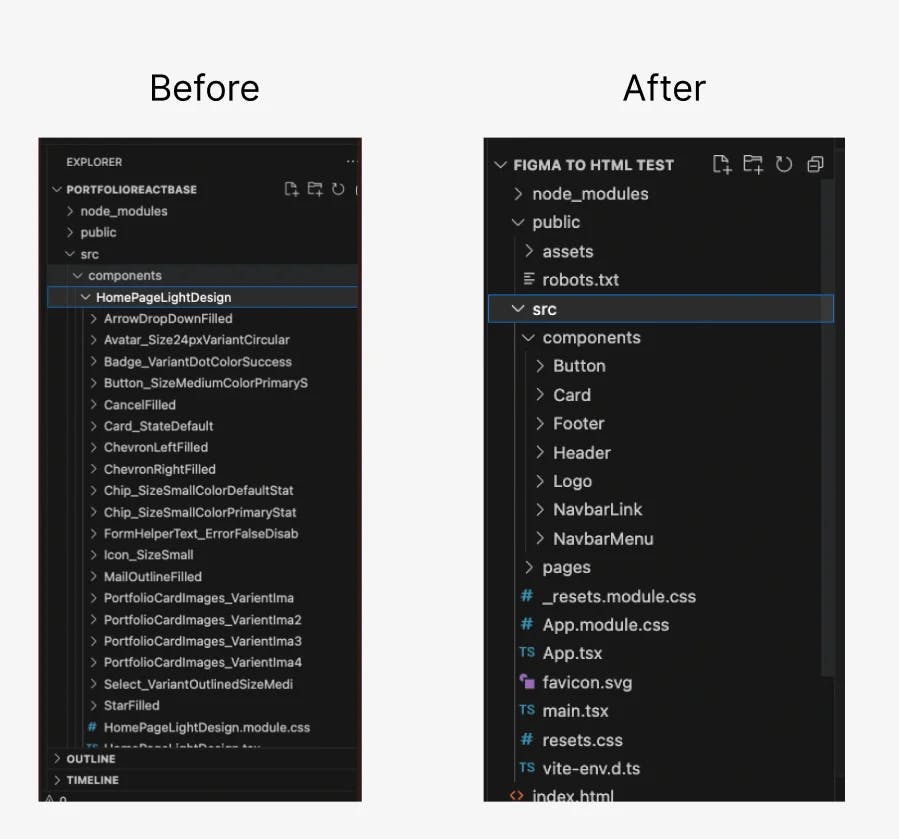
Moreover, disorganization and code non-reusability posed challenges, making edits difficult and potentially affecting server performance.
To remedy these issues, I reorganized and cleaned the code. The before-and-after comparison shows the transformation, with components now neatly organized into folders for easier editing and improved clarity.
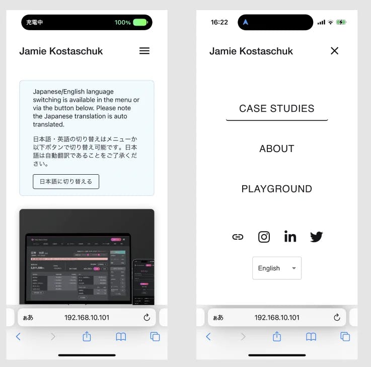
This is the mobile header I created after implementing the responsive design.
While I made simple edits directly in the code for minor changes, I opted to design a base layout in Figma for this larger area before making any code adjustments.
Creating more pages
I prioritized implementing a Content Management System (CMS) before expanding to additional pages like case studies.
For new pages, I followed a similar Figma-then-code process for design and implementation.
Connection to Headless CMS
A CMS, or "Content Management System," enables users (in this case, myself) to easily handle site content. Since I'm building the front end, I specifically explored headless CMS, which stores data for display on my site.
Selection
There are several headless CMS services. Some that I considered are:
- Strapi.io
- WordPress
- Prismic.io → The selected service
I chose Prismic for this site for several reasons:
- Reference Starter Sites: Prismic offers various starter sites for reference, including a multi-language option.
- Affordability: Despite being hosted on their servers, Prismic is cost-effective for individuals, and in my case, it's free.
- "Slices" Feature: Prismic's "Slices" feature is particularly promising. I will go into more detail on this below.
Connection of CMS
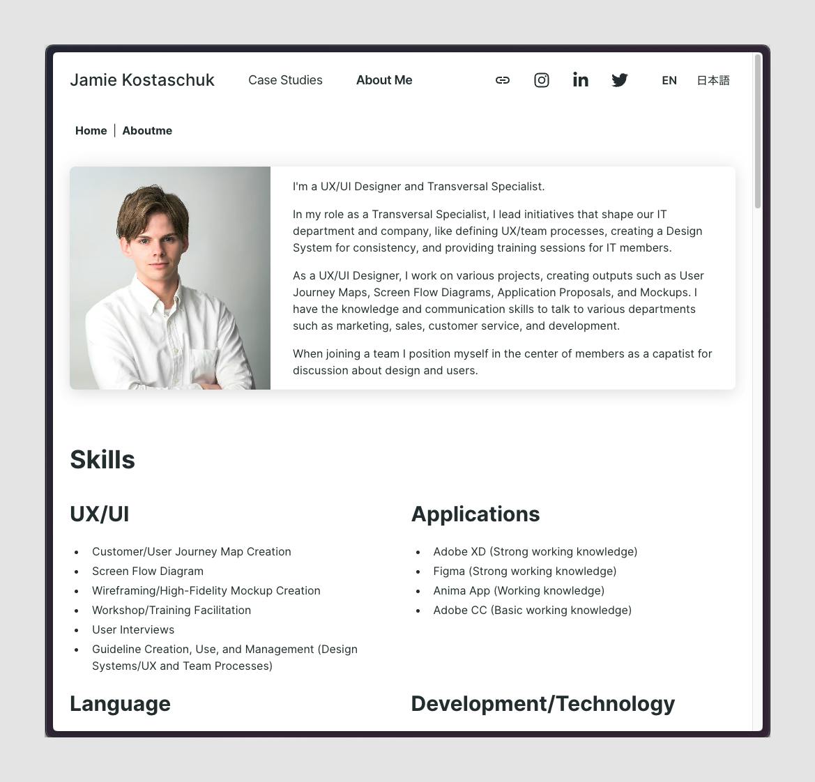
In the initial phase, I successfully integrated Prismic with my site and concurrently developed the About Me page. This step allowed me to manage the site's content through the CMS, facilitating easy text changes. However, this setup does not allow for changes order of contents or sections through the CMS.
Enhancement of CMS
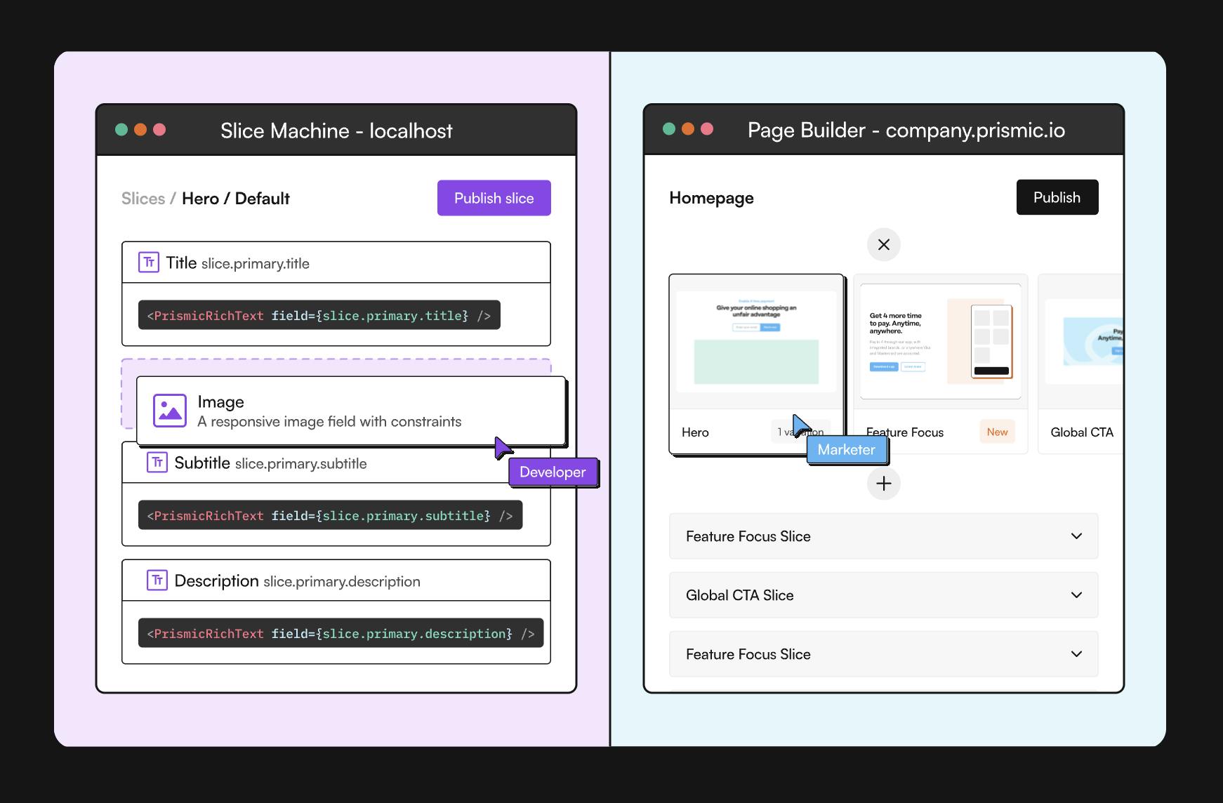
Prismic has a "slice machine" feature that is very powerful, and I wanted to use it to easily manage all aspects of the site.
Slice machine allows users to create reusable "slices" of content on the site, and freely change the order of sections and what sections to show on any page. It also allows for pages to be easily added and deleted.
Here was a big challenge for me - to utilize this feature, I had to recreate my entire site.
My site was written as a basic react site, but this feature required me to use Next.js in a specific setup for Prismic.
This was a needed feature to have this a maintainable portfolio site, so I rebuilt the site by using the multi-language Prismic starter. This took a lot of time but allowed me to use other frameworks such as Tailwindcss.
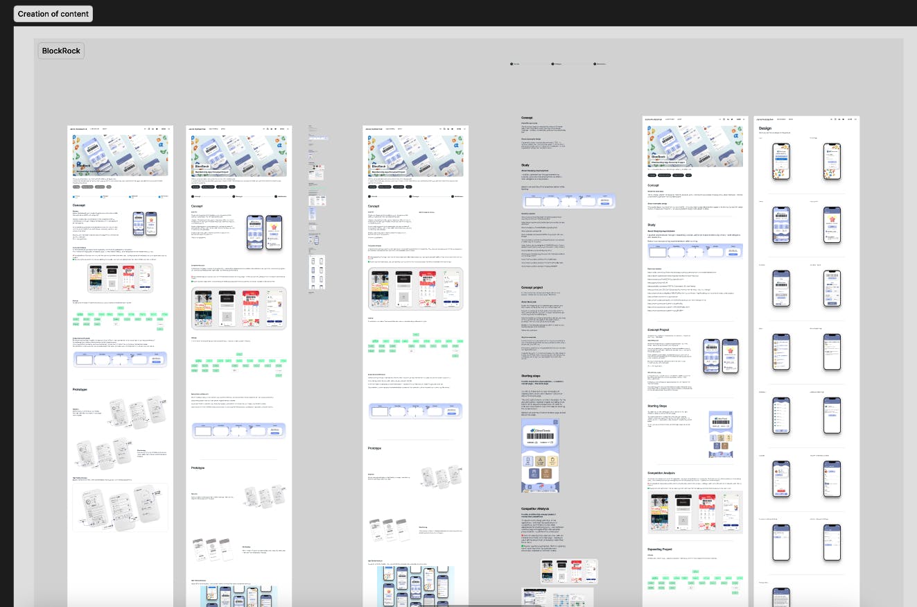
Expansion
To create the case study pages, I extracted content from an older portfolio as a foundation.
I began by copying and organizing the content to ensure a logical flow. Subsequently, I designed a mockup to visualize the content and iteratively refined it through multiple reviews.
For instance, in the case of the "BlockRock" example, the initial portfolio mainly showcased the application without delving into why I initiated the project.
In the updated version, I provided more context on the project's inception, detailed my process, highlighted successes, and identified areas for improvement.
To enhance readability, I separated application images onto a distinct page, streamlining the case study page.
Accessibility
While to a minimum, I have started to take action to improve the accessibility of this site.
For example, I have ensured that all pages are readable by screen readers by the appropriate use of headings.
To do this I created a flexible header component that allows for customized heading HTML tags for different headers on the page, and also hidden headers where a visual header is not wanted, but needed for screen readers.
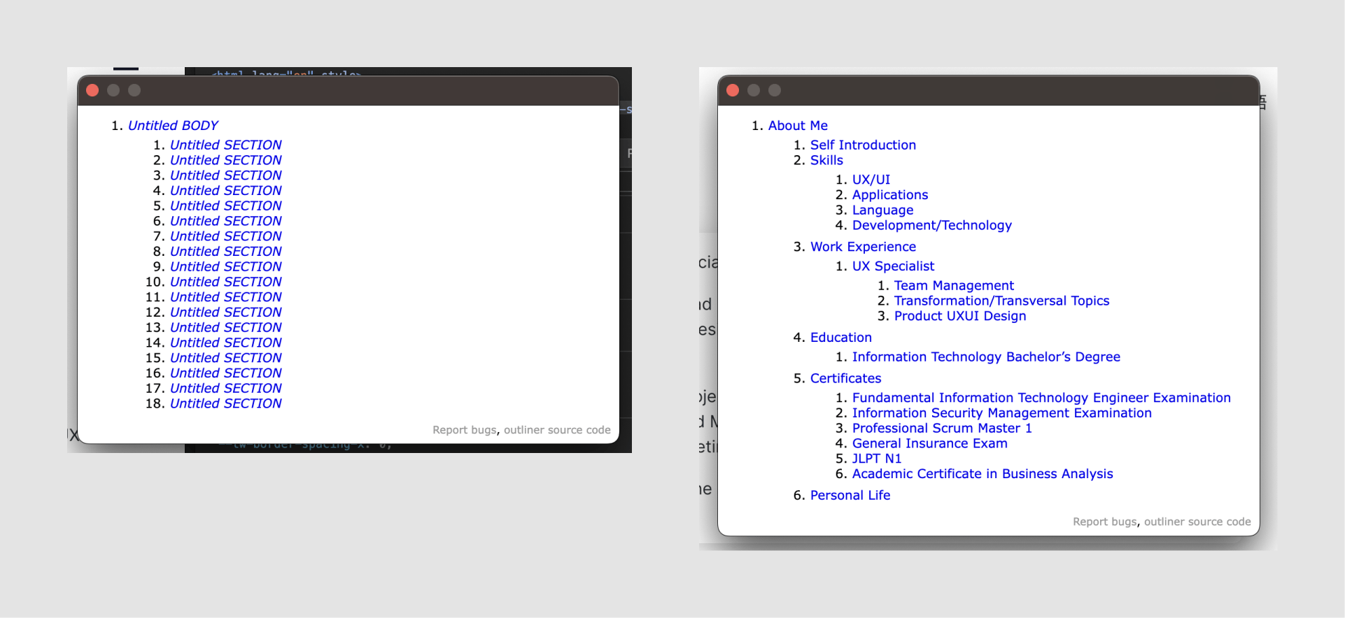
The following image is how a screen reader would scan my "about me" page, before and after implementing correct header usage. To output this I am using the plugin HTML5 Outliner.
As you can see, before I had a big list of Untitied Sections on my page - no information for screen reader users to understand the content. now all sections are labeled, and nested within each other.
While the correct use of <h> tags is important, it is often forgotten or overlooked by designers, so I am glad to have gone through this for my practice.
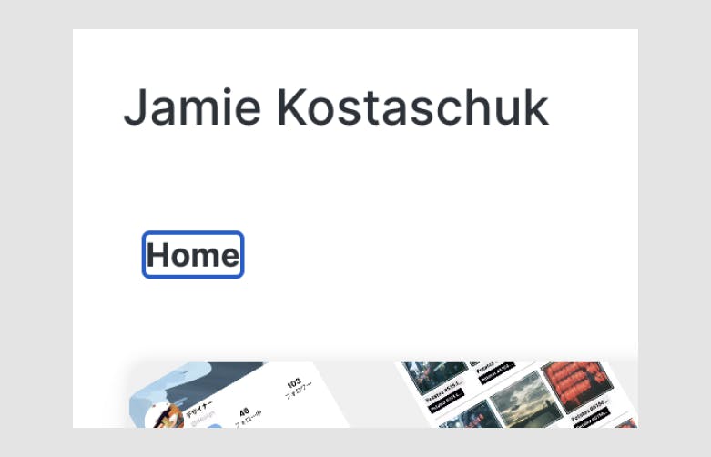
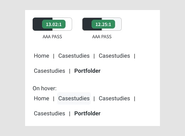
I have also ensured that touchable/clickable items have appropriate touch/click surfaces, an example of the before and after for breadcrumbs is below.
Before:
The touch area height of breadcrumbs was only the height of text - 24px.
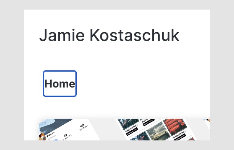
After:
The touch area height of breadcrumbs includes padding - becoming 40px.
For text used, I also went through to check whether or not the colors meet contrast requirements for readability. This also allowed me to redefine the design for some areas. An example is the breadcrumbs below.
I understand that when truly applying accessibility practices for color, things like the hover colors, link colors, etc. should also be tested and identified.
Before:
The breadcrumbs used a bright color to show the current page - this made it stand out but did not have enough contrast.

After:
The breadcrumbs now have all links with enough contrast, and the current page is bold, making it stand out without relying on color.
Refinement
Design Foundation
Now with the site base done, I went through and designed styles to improve and create consistency for the site.
For things such as spacing and border-radius, I am following Tailwindcss it is already well defined. However, for typography size and colors, which are very noticeable to users, I defined my own scales.
In the implementation of these styles in the code, I also removed old styling patterns in the code, deducing tech debt.
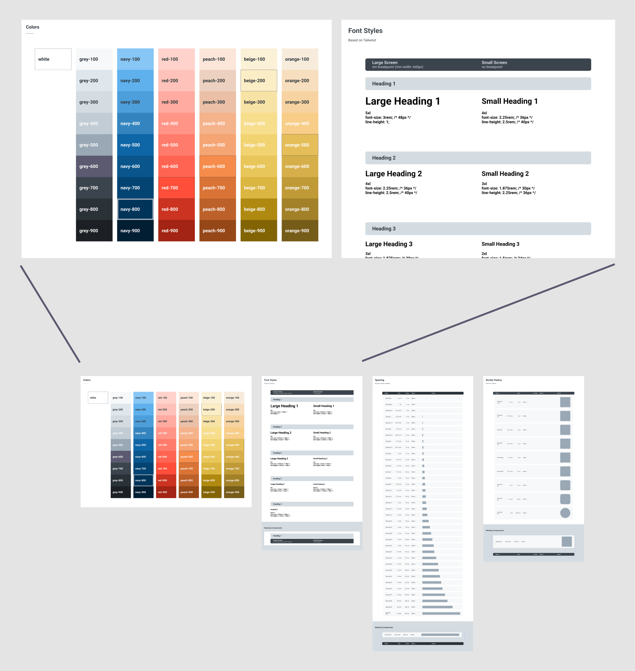
In code, I am also managing these styles in a centralized place. For example, colors are in the tailwind config file and are only defined once.
As this is a personal project and can be managed by me:
- I am only adding the needed values into the code for simplicity.
- I am not creating any "semantic" tokens of colors, etc. Semantic tokens take the current "primitive (as is)" values and give them a meaning - for example "color.button.active".
If this was a project with developers and more members, I would consider creating a semantic token list and managing all styles in code as well.
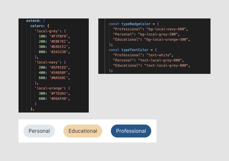
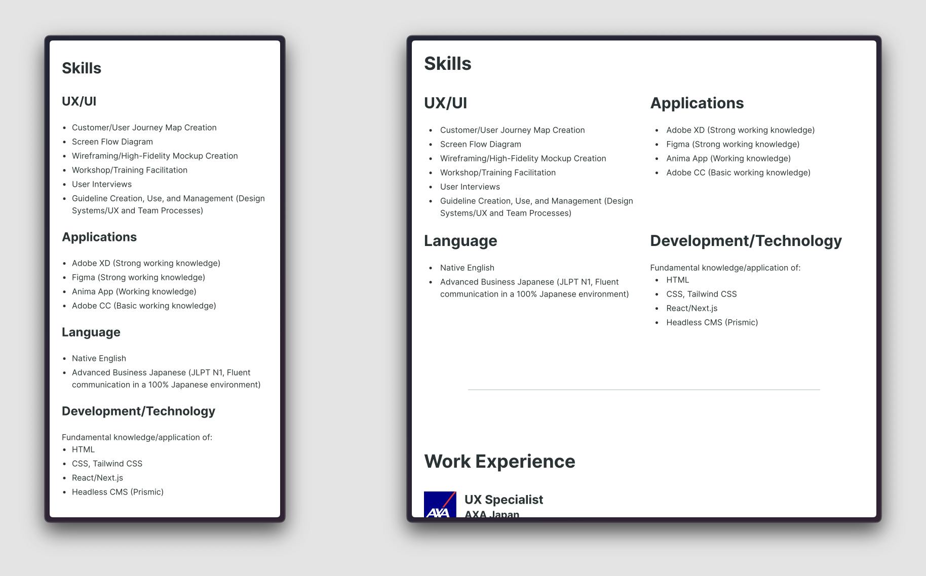
The following are examples of styles being stored (left) and used (right) in the badge section of the code.
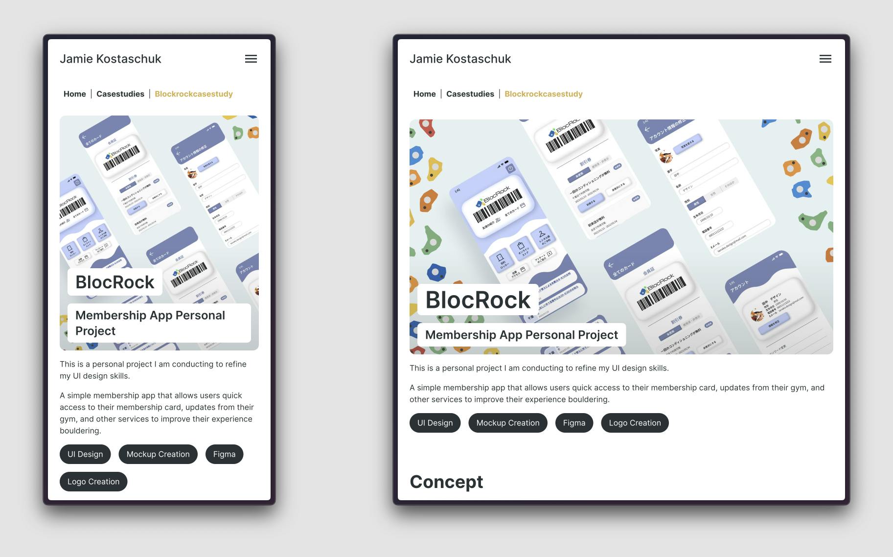
Below are examples of how the heading text size changes depending on the screen size.
I implemented this to have a proportional-looking design on both large and small screens.
Case Study Page Header
About Me Page Section
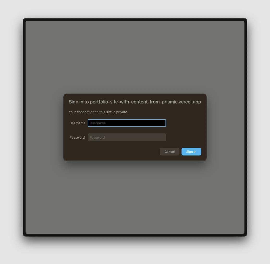
Security
Technical Security
For security of contents, I created basic auth on the site. Despite basic auth not being perfectly secure, I chose it as it is strong enough for my site and easy to implement.
As of updating this case study, I am publishing this site publically, but this basic authentication is still available for me to make required at any time.
Non-technical Security
In case the site crashes at some point, I have recreated everything in Figma so I stuff have an MVP I can send to others.
Design Points
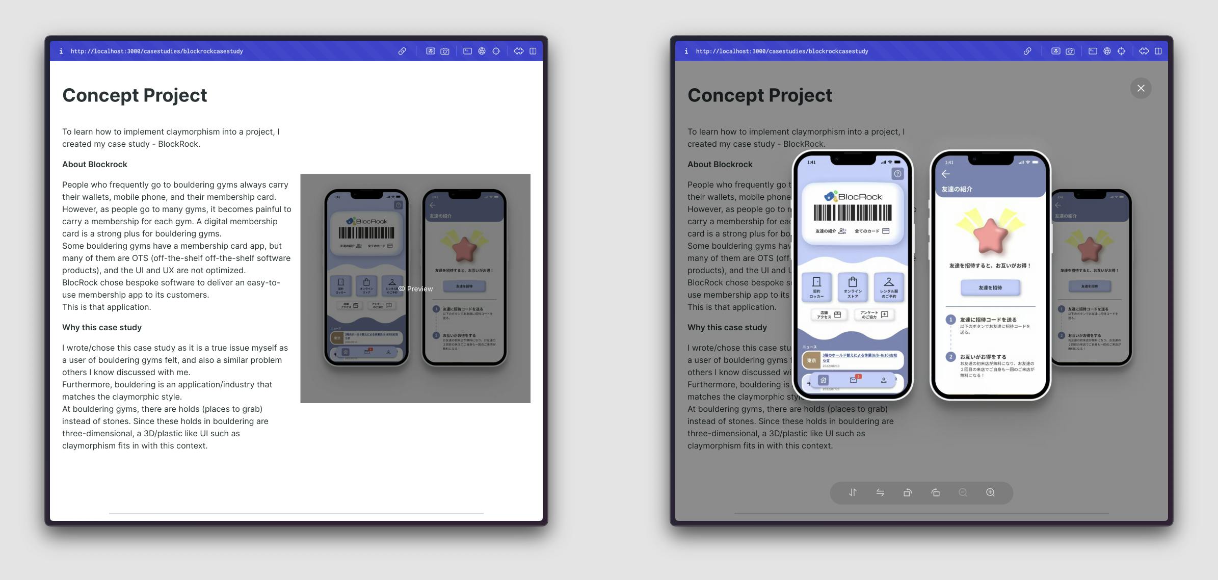
I quickly tested an older portfolio with acquaintances to define what is needed in this portfolio site. I found that people wanted to click on images throughout the site, but could not. Therefore, I added the ability to inspect images to this site.
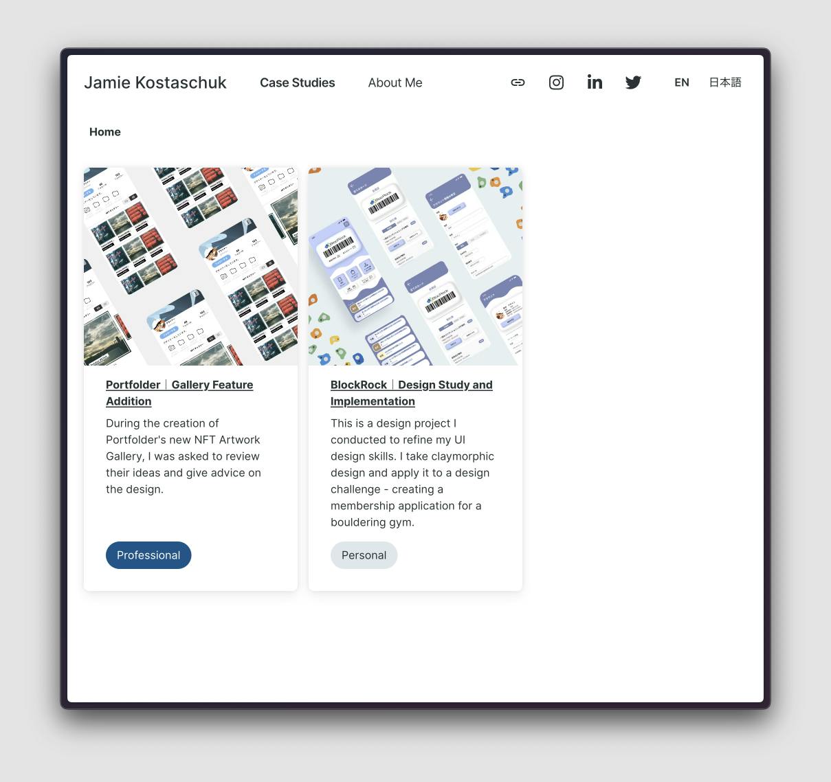
From my experience reviewing designers' portfolios when hiring, people who review portfolios do not have a lot of time to read each portfolio - So I have made my home page simple with links to my case studies. If someone wants to know more, they can learn more about me on the About Me page.
Challenges of this Project
There were several challenges to this project.
The biggest challenge was the routing system with headless CMS.
Having 2 locales (English and Japanese) and different page types with different routes ("/" for home, "/casestudies/casestudy" for a case study) was a challenge for me as a non-developer.
I overcame this through referring to other's work, discussing with developer acquaintances, and trial and error. However, for the different routes, I ran into issues in production and decided to simplify the routing system - now pages are either "/" for home, or "/pagename" for a specific page.
Through this, I have now learned a lot I can use for future projects and when discussing with developers.
Relatedly, there are also challenges with the headless CMS I used. It is non well documented, had errors that were not my fault, and the "slice system" I was looking forward to has its issues/limitations.
I have learned to research more about the technologies I want to use before implementing them.
Reflecting Words
Through this project, I was able to achieve my goal - a CMS-connected, multilanguage site, and I was able to deepen my knowledge of development technologies.
However, I did not create something that would be “the best” in terms of my design ability.
I would redo this project by paying more attention to the site design at the start, in two ways:
1: The theme/overall style of the design
This site is very simple, but I should have explored other options. For example, this portfolio will realistically have 2-3 case studies at any point in time, but the current page structure allows for a lot more to be displayed at once - this could have been explored more.
2: Think through the needed slices and their groupings more
I created several slices for this site, but it became clear once using these that the way these are built is not ideal, leading to large spacings when using them together based on their margins.